

Everything you need to design for Newberry House
Logos, colours, type, rules and the files behind them. Click a colour to copy it, download any logo in SVG or PNG, or take the whole kit in one go.

Logo
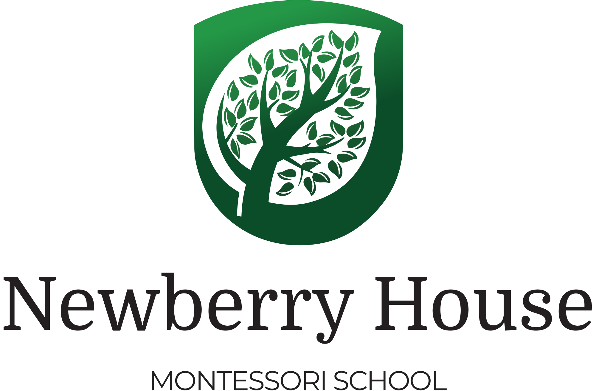
A shield with a tree, and the words Newberry House, Montessori School. Three formats, each in three versions. Use the files exactly as they are; the wordmark is artwork, so never retype it.
















Clear space
Keep a margin on every side at least as tall as the capital N in Newberry. Nothing sits inside it: no text, no edges, no other logos.
Minimum size
Stacked and inline: 120 px wide on screen, 30 mm in print. Below that, use the emblem on its own. The emblem works down to 16 px, which is the favicon.
Never
Stretch, rotate, recolour, add a shadow or an outline, redraw the tree, or place the colour version on a photograph without a white card behind it. The shield is always green, dark or white.
Colour
Click any swatch to copy its hex value. Roughly 70% of any layout is white or off-white, 20% Newberry Green, 5% Dark Green, and the rest neutrals with a touch of gold.
Greens
Neutrals
Accents, used sparingly
How much of each
- 70% white and off-white
- 20% Newberry Green
- 5% Dark Green
- 5% neutrals and gold
Not in the palette: neon or electric greens, pure black backgrounds, bright reds and oranges. Gradients belong in the logo only.
Take the palette with you
:root {
  --color-newberry-green: #3A913F;
  --color-dark-green: #2D5016;
  --color-forest-green: #1B5E20;
  --color-accent-light: #6AAF6E;
  --color-near-black: #1A1A1A;
  --color-charcoal: #333333;
  --color-warm-grey: #6B6B6B;
  --color-light-grey: #F5F5F0;
  --color-off-white: #FAFAF7;
  --color-white: #FFFFFF;
  --color-gold: #D4A843;
  --color-soft-teal: #4CAF50;
}Typography
Two families, both free on Google Fonts. Montserrat for headings, Open Sans for everything you read. No serifs and no italics anywhere, apart from the wordmark inside the logo.
Headings and display
Montserrat
Light. Sunlit vineyards and mountain air.
Regular. Showcasing what is possible.
Bold uppercase. Toddler, 18 months to 3 years
Light 300 for hero display, Regular 400 for H1 and H2, Bold 700 for uppercase H3 labels.
Body and interface
Open Sans
Regular. Our learners move freely between the classroom, the garden and the estate, guided rather than instructed.
SemiBold uppercase, for buttons
Bold, for a word that matters.
Light 300, Regular 400 for body, SemiBold 600 for buttons, labels and links, Bold 700 for emphasis.
| Use | Face | Size | Leading |
|---|---|---|---|
| Hero display | Montserrat Light 300 | 72 px | 1.1 |
| H1 | Montserrat Regular 400 | 48 px | 1.15 |
| H2 | Montserrat Regular 400 | 36 px | 1.2 |
| H3, uppercase | Montserrat Bold 700 | 24 px | 1.3 |
| H4 | Open Sans SemiBold 600 | 18 px | 1.4 |
| Body | Open Sans Regular 400 | 16 px | 1.6 |
| Small | Open Sans Regular 400 | 14 px | 1.5 |
| Caption | Open Sans Regular 400 | 12 px | 1.4 |
| Button, uppercase | Open Sans SemiBold 600 | 14 px | 1 |
Get the fonts
Both families are open licence. Download them for print and desktop work, or embed them on a website.
Web embed
<link rel="preconnect" href="https://fonts.googleapis.com">
<link rel="preconnect" href="https://fonts.gstatic.com" crossorigin>
<link href="https://fonts.googleapis.com/css2?family=Montserrat:wght@300;400;500;600;700&family=Open+Sans:wght@300;400;600;700&display=swap" rel="stylesheet">
Font stacks
--font-heading: "Montserrat", "Helvetica Neue", Arial, sans-serif;
--font-body: "Open Sans", "Helvetica Neue", Arial, sans-serif;- Headings in Newberry Green or Dark Green. Body text in Near Black.
- A heading may switch colour on its key words: Dark Green first, Newberry Green on the words that matter.
- Body lines no longer than about 72 characters.
- Emphasis inside a heading is Leaf Green at the same weight, never italic, never another face.
In use, light and dark
The same pieces on the two surfaces you will meet most: the off-white page and the dark green panel. Light is the default; dark green is for footers, call-to-action bands and covers.

World class Montessori education on a working wine estate
Authentic AMI Montessori from 18 months, Cambridge International to Grade 12, and a campus where the lesson often happens outside.
Toddler, 18 months to 3 years
Small groups, a prepared environment and a guide who follows the child. Read more
Off-white page, white card, green accents.

Ready to experience it for yourself?
Walk through the grounds, meet the team and see the campus in action. Tours run weekly through the term.
Newberry House Spier
Our second campus on the Spier Wine Farm, Stellenbosch. Register interest
Dark green panel, white logo, Leaf Green for emphasis and links, gold for the one action.
Imagery and icons
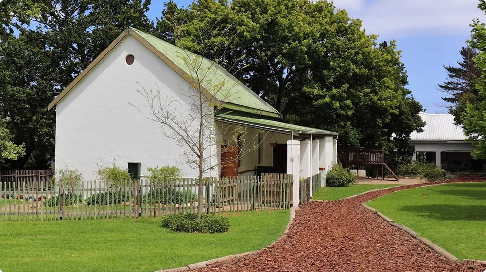
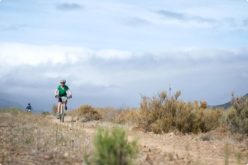
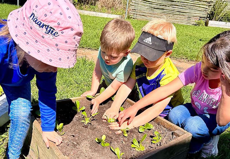
Photography does the storytelling. Natural light, warm tones, real children in real places on the estate, caught doing something rather than posing for the camera.
Photographs
- Full colour with a warm white balance. No heavy filters, no moody grading, greens that look like the real thing.
- Full-bleed for section openers, pairs and grids within content, rounded corners on every crop.
- Staff portraits in a circle or a rounded square, in natural light outdoors.
- Text over a photograph always sits on a dark green overlay at 60% or on a white card.
Icons
- Outlined, never filled. A 2 px stroke with rounded caps and joins.
- One colour: Newberry Green on white, or white on green.
- 48 px as a section marker, 24 px in lists, 20 px in interfaces, always with a text label.
Voice
Warm, confident, clear and a little inspiring. We write as a school talking to partners in a child's education, in South African English, in the first person plural.
The mission
“To showcase what is possible in education.”
Three words carry the brand: Education, Environment, Experience. Say them in that order and give them the same weight.
| We say | Not |
|---|---|
| learners | students, pupils, kids |
| guides, educators | teachers (unless quoting Cambridge) |
| families, parents | clients, customers |
| environment | classroom (for the prepared space) |
| Newberry House | NHM, Newberry Montessori |
| colour, programme, organise | color, program, organize |
Do and don't
- Let photography lead and the design support it.
- Keep green as the one dominant accent, the same green every time.
- Give everything room. Whitespace is part of the brand.
- Use Montserrat for headings and Open Sans for everything else.
- Use outlined icons with a 2 px stroke, in green on white or white on green.
- Show real people in real places: Lourensford, Spier, the vineyards, the mountains.
- Round every container. 8 px for inputs and buttons, 16 px for cards.
- Put a dark green overlay or a white card between text and a photograph.
- No more than two greens in one layout.
- No stock photography that feels corporate or staged.
- No sharp corners, no harsh edges, no gradients in layouts.
- No dark mode as the default. The brand is light and airy.
- No serif, script or decorative type outside the logo wordmark.
- No italics anywhere. Emphasis is weight or Leaf Green, never a slant.
- No neon greens, pure black backgrounds, bright reds or oranges.
- No body text straight on a busy photograph.
Downloads
Everything on this page as files, plus the design system itself.
- Brand kit (zip)All nine logos as SVG and 2000 px PNG, DESIGN.md, colours.css and colours.json.
- DESIGN.mdThe written design system: colours, type, components, spacing, imagery, voice. Plain text, readable by people and by AI agents.
- Figma design systemLogo, typography, colour, components and page templates. Open it in Figma and use File, Duplicate to work from a copy.
- Fonts on Google FontsMontserrat and Open Sans, open licence, free for print, desktop and web.
- colours.cssThe twelve colours as CSS custom properties.
- colours.jsonThe same colours with names and roles, for design tools and scripts.
Building with an AI coding agent? Point it at DESIGN.md and llms.txt. Questions about the brand go to secretary@newberry.co.za, or contact the office.